
There’s one big thing about Rodrigo Corral that does not initially make sense: The book cover maestro does not have a signature style.
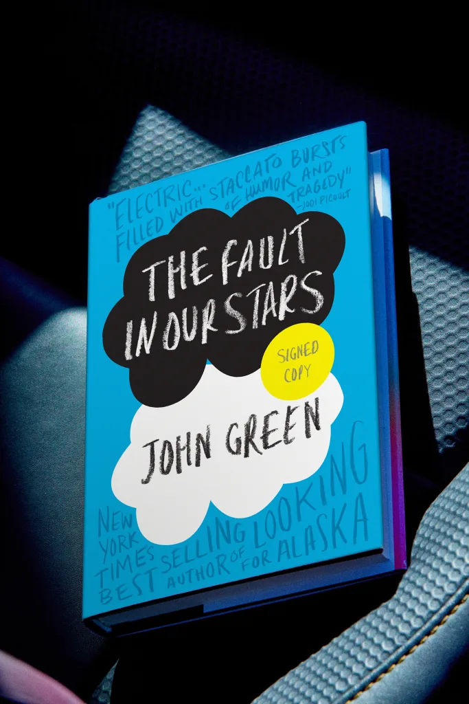
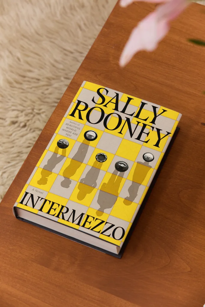
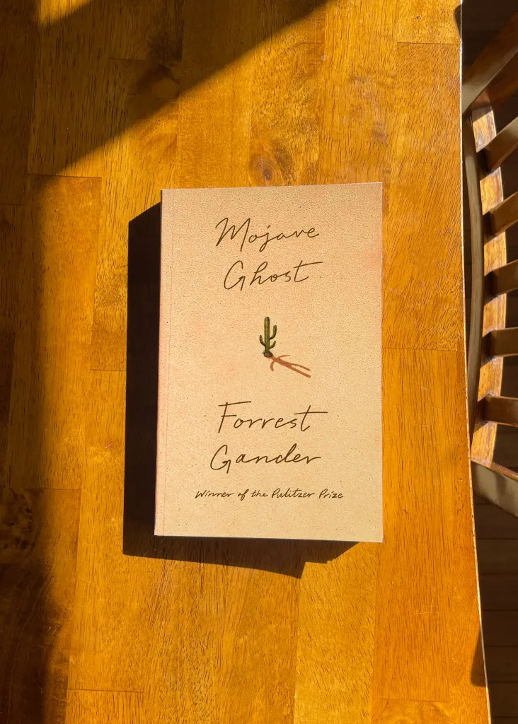
Consider his chameleonic cover hits. The Fault in Our Stars. The Brief Wondrous Life of Oscar Wao. Survivor, Lullaby and the rest of Chuck Palahniuk’s catalog. Rachel Cusk’s books. James Frey’s controversial A Million Little Pieces, the cover that helped launch Corral into ubiquity. Recent collaborative output like Intermezzo and Mojave Ghost. The books don’t have obvious visual connective tissue between them—but somehow, as creative director of Farrar, Straus and Giroux and his eponymous studio, Corral has spent the past three decades quietly redefining the look of the modern book again and again.
“A thing that we repeat often in the studio is, ‘Let’s be careful of what we’re good at, because it is the kind of work that you will attract,’” he says.
Corral has heeded that caution throughout his career, avoiding pigeonholes and a life of designing the same jacket over and over—which is notable in a design subset often particularly driven by trends. Consider the Big Book Look of the ’60s, or the ubiquitous Book Cover Blob that seemingly seeped onto every jacket a few years ago. If a style has a proven track record, risk-averse publishers or marketing departments are quick to embrace it.
Corral’s output, which often feels consistently contemporary, is novel for its sheer novelty.
“Book covers usually follow trends,” Frey, one of Corral’s earliest clients, told me in an email exchange. “Someone makes a great one and everyone else copies it. If you care about such things, and I do, and try to find who made the original great one, it’s always Rodrigo.”
GETTING WHAT YOU CAME FOR
Corral was born and raised on Long Island, New York, the child of immigrants from Colombia. His parents ran a travel business together, not entirely unlike how he and his partner Anna Corral operate his personal studio today. Books didn’t play a huge role in his youth, but when he was around nine or 10, Corral’s parents bought him a set of Encyclopedia Britannica—and he savored their object quality.
“I’d start cracking them open and appreciating the materials, the foil stamping, the faux leather,” he says, recalling how the anatomy section featured acetate layering for the nervous system and the muscular system. “Those are my closest earliest memories of a book experience.”
After realizing design and art was a path he wanted to pursue, he applied to the School of Visual Arts, where he found himself studying under industry icons like Chip Kidd and Barbara deWilde.
“They just always had a smile on their face,” he recalls. “And their work alone, it just had wit, it had charm, it had layers. And that really for me was like, ‘OK—I think I’d like to join the space, or at least try my hand at it.’”
After leaving SVA, Corral got a job at Farrar, Straus and Giroux in 1996, where his first assignment was a paperback edition of Getting What You Came For: The Smart Student’s Guide to Earning a Master’s or a Ph.D. The book already had cover art, and he was disappointed that he didn’t get to infuse his own creativity into the project. Then he decided to make the best of it. The all-yellow cover featured a black-ink New Yorker-style illustration of a person hoisting a degree into the air. He made the diploma white to highlight its importance of, well, getting what you came for. It was a tiny victory, but perhaps an important early lesson in how one can infuse their perspective into an at-times rigid paradigm.

On the whole, Corral loved his early days at FSG, especially because it was an environment where young designers got to sit in on meetings and where the publisher would walk the halls and greet everyone personally. Designers and their work were valued, which helps explain why it’s a house with a long history of fantastic cover output—from Joan Didion’s Slouching Towards Bethlehem (Lawrence Ratzkin) and Tom Wolfe’s The Right Stuff (Kiyoshi Kanai) to contemporary jackets like Jonathan Franzen’s Freedom (Charlotte Strick) and Tove Ditlevsen’s Copenhagen Trilogy (Na Kim).
“Farrar, Straus and Giroux has always been a powerhouse literary publishing house that is editorially driven. And what that means from a design standpoint is we’re not reacting to what the markets are asking us,” Corral says. “It’s strong points of view with brilliant editors and a publisher at the helm [who] are reacting through fiction and nonfiction to what the world is telling us, in many ways. And so that all leads to supporting great design.”
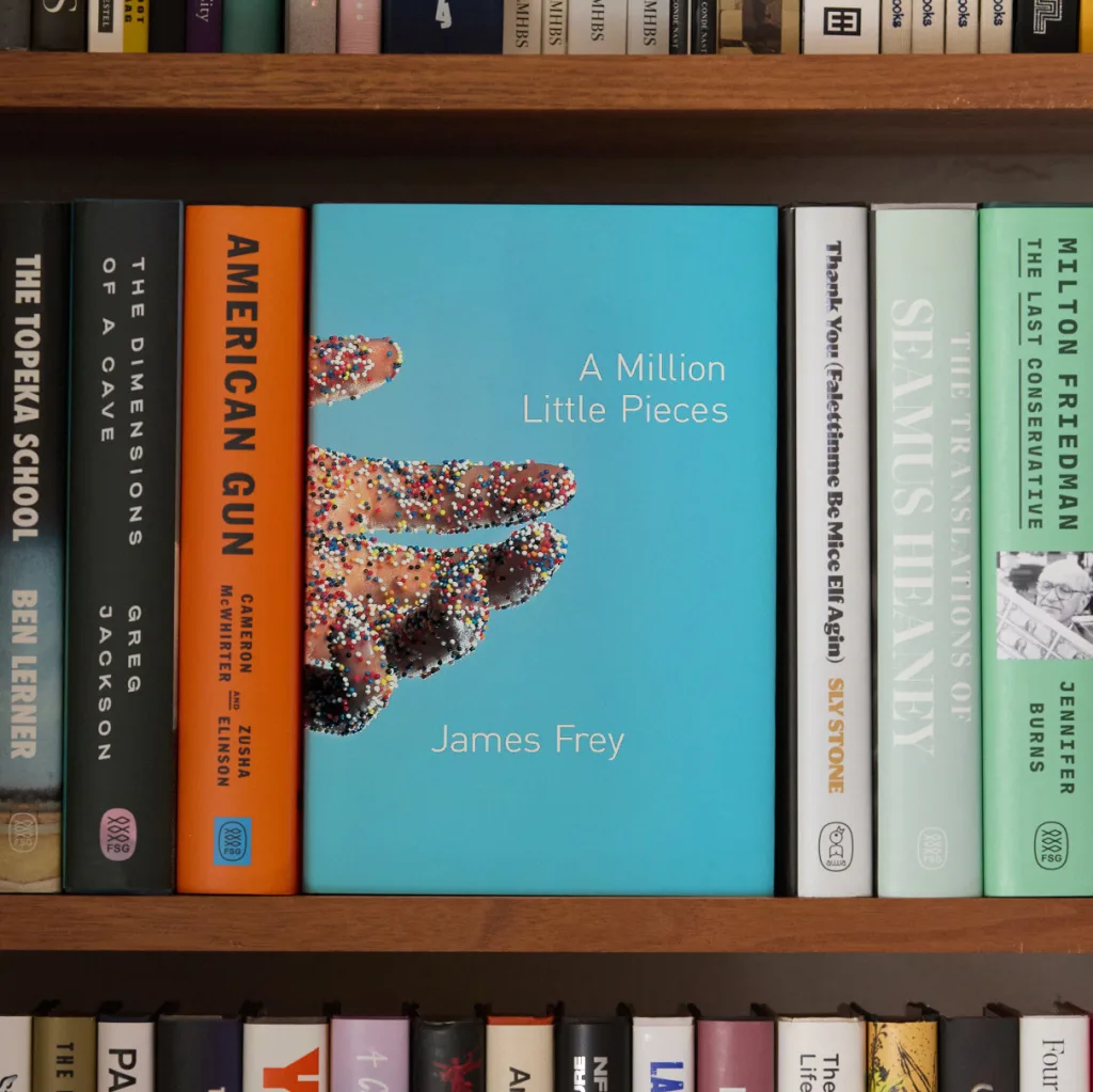
After five years at the company, Corral says there wasn’t much room for upward movement, so he left and did a stint at Grove Atlantic, followed by Doubleday. He was laid off in the post-9/11 publishing downsizing, but was given nine months severance—and that’s when he started Rodrigo Corral Design Studio. He opened it in the back of a friend’s production house, A2A Graphics, in Chelsea. And soon after he took on his first project: the cover for A Million Little Pieces.
REDEFINING THE BESTSELLER
But two decades on, you can probably instantly envision it—that outstretched hand, the kaleidoscopic candy dots, that hospital-hued background.
Frey had no clue what Corral was going to turn in, but he did have high expectations for the cover to his addiction saga. With a background in art and art history, Frey had been sending Corral paintings of hell by old masters and related imagery.
“Thankfully, he ignored them all and made his own cover,” Frey recalls. “When I saw it, I was initially taken aback. Visually, it’s very arresting, jarring. … It felt sharp, dangerous. It also felt lonely, and somehow broken. All of which were a reflection/representation of the text.”
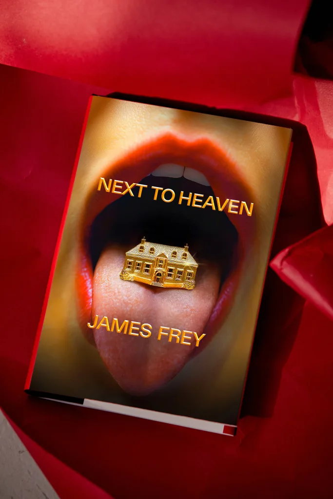
Frey, who also worked with Corral on his upcoming book Next to Heaven, says he didn’t respond for a day. He let his feelings settle.
“And when they did, I was in love.”
Corral came up with the idea on the way home from his studio. He would often walk past a particular confectionary shop. A package of candy dots in the window always jumped out at him, and as he was pondering Frey’s book, it clicked. He took his entire fee for the project and hired a photographer, and the two brought the cover to life.
Ultimately, Corral says the publisher didn’t quite know what to make of it, and found it to be off-putting—but they said they couldn’t stop looking at it. It yielded a visceral reaction.
“It cemented the tone for the kind of work we wanted to attract,” he says. “We wanted to do work that was not fitting nicely and neatly into a category and that did not necessarily fit the mold of what a bestseller must look like.”
Catherine Casalino remembers the early days at Corral’s studio. She joined as an intern in 2003, and soon became full time.
“Rodrigo has made a habit of swinging for the fences, and he encourages anyone who works at his studio to do the same. A big part of that is constantly seeking out fresh inspiration and collaborators,” she says. “In an age where you can easily marry up a stock image and a font to create an instant cover, or make a living by producing the same style of cover over and over, Rodrigo pushes back against that kind of process. You hire his studio not because you know what you’re going to get, but because you know they can deliver something special that you would never have imagined.”
SOLVING THE BOOK
While Corral may intentionally lack a signature style, he has a signature approach—and it yields work that can feel urgently relevant. When he’s designing, Corral starts with what he dubs “bad poetry”—he reads the manuscript and jots down quick notes in his phone. The ones that still resonate days or a week later are what he’ll start to focus on pushing forward. From there he concepts and designs. Sometimes he’ll start a cover and finish it completely. Other times in the studio he’ll have multiple people working on something.
He likens the book design process to cinematography. To explain, he offers the concept of a book that has oranges as a theme. A cinematographer ponders, say, the temperature of the film, the color, whether it’s set primarily during day or night.
“I find that parallel with book covers, where it’s typography, it’s scale, it’s composition, it’s lighting—and all those things can play into how that same orange can be very different on two different covers,” he says.
Current Random House vice president, executive art director Greg Mollica joined Corral’s studio as a junior designer circa 2002/2003.
“He’s a deep and close reader; he’d read manuscripts all day, bring them home and read them again at night, and come into the studio the next morning with ideas and brilliant singular ways to execute them,” Mollica recalls. “What struck me first about his studio and process was that the fine art, photography, fashion and culture books outweighed the traditional graphic design books in his personal collection. He was always devouring images and collecting art. Art was everywhere. Rodrigo thought like an artist—that’s what separated him in the cover design world.”
In 2011, Corral rejoined FSG as creative director, and today that is officially his full-time job. “The decision to return felt strangely predetermined,” he says.“When I looked at the publishing landscape [publishers and imprints], I kept coming back to FSG as the place where I could contribute and feel valued as a visual artist.” He splits his time between New York City and California, and operates his independent studio—which works across all publishing houses for projects or as a creative director at large—after-hours.
At FSG, he says he works with a team of experienced designers in a bit of an autonomous environment. On the studio side, he sees it as more of an agency model that utilizes Anna Corral’s background in branding and marketing in chorus with his creative direction.
On the whole, “How we try to look at projects is we’re not solving to a style—we’re solving the book itself,” he says.
Casalino would seemingly agree.
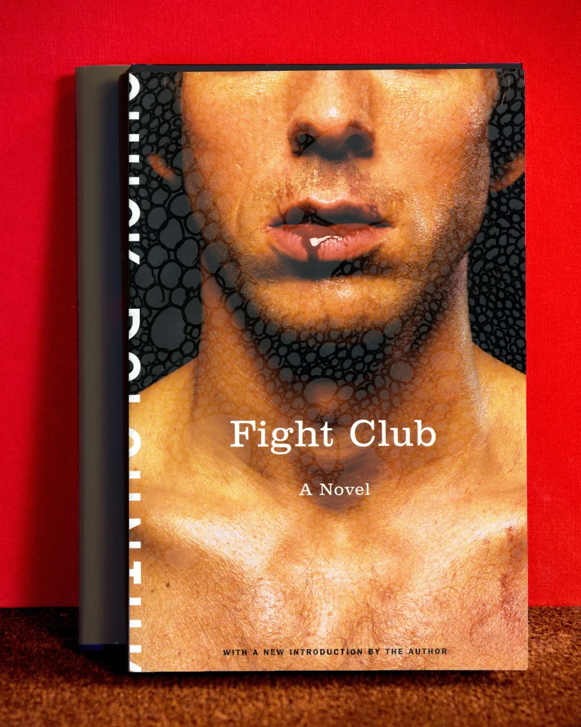
“I think Rodrigo’s impact on modern book cover design is that he responds to the unique voices of modern literature in a way that truly reflects where modern literature is going,” she says. “I remember him saying that he got assigned Chuck Palahniuk initially because the writing was so unique that no one knew quite how to approach it. Instead of making those covers look like prior fiction, he reflected that unique language with a unique visual language.”
BY A SHOW OF HANDS
Those who have passed through Corral’s studio make up a remarkable roster. There’s Mollica. Casalino. June Park, Elena Giavaldi, Ben Wiseman, Liana Finck, Tyler Comrie, Jason Ramirez, Christopher Brand, Devin Washburn, and on and on. Today, he works with Adriana Tonello, Giacomo Girardi and a couple others.
Corral won’t take credit for any of their careers or talent. But he does have an impressive track record of hiring wildly talented individuals wherever he oversees design—and that, perhaps, is his greatest contribution to publishing at large, beyond any single image.
“If you hosted a book design event in NYC and you asked the audience by a show of hands who has mentored/worked with Rodrigo—over half the audience would raise their hands,” Mollica notes. “He’s mentored countless designers who are now exceptional art directors. The book cover industry would be completely different without Rodrigo’s influence. That is not an exaggeration. He’s our Paul Rand.”
For his part, Corral says he’s always looking to surprise himself in his design work—and whether at FSG or his own studio, he is always seeking to help his teams surprise themselves, too.
“I think Rodrigo’s work has encouraged more designers and publishers to push back against stereotypical cover design and rise to meet the incredible creativity that modern authors are producing,” says Casalino.
Or, as Corral puts it—and likely put it years ago with that cover for A Million Little Pieces: “Hopefully we’ve delivered projects that can be genre-busting or genre-breaking, and that can become little victories for the future—for designers to say, Look, this book was successful with that jacket. Why can’t we as a house take that same leap?”
What is Rodrigo Corral’s style? I don’t know. But if you spot a cover in a store that feels like it was designed and printed just moments before, there’s a good chance I could guess who art directed or made it.